

By Roger Coppock
January 23, 2015 (San Diego)--What will global warming do to our planet? Specifically, if we continue with "business as usual," burning fossil carbon fuels and dumping CO2 into the atmosphere in increasing amounts, what temperatures will our children see at the turn of the next century? When climate scientists make projections like these, they use mathematical tools called "Climate Models." Climate models are collections of mathematical formulas describing our planet. Usually, these formulas are represented by a computer program. These computer programs are typically monstrously large and very complex.
In my career as a computer programmer I confronted many computer programs so large that they were intimidating. These programs had a history. They started as a small program witch did one thing well and then grew to have so many commands that no one knew them all. Often, the commands were unrelated, just some options that some computer programmer added to the program a few years ago because they thought that it was cool. Imagine a pencil sharpener that made ice cream. Logical, of course! Both pencil sharpeners and ice cream makers have a manual crank, so why wouldn't you combine them into one thing?
Eventually, these computer programs collected so many features that only a few experts could use them. A layperson could go to sharpen his pencil and get a dish of Rocky Road ice cream. Only an adept could put a sharp point on their pencil, and it took years of self-sacrifice to become an adept.
Hoare's Law of Large Computer Programs states that, "Inside every large program is a small program struggling to get out." (See Note 1 below.) I made a career of birthing those small programs. They were very popular at the institutions I created them for. They made good educational tools, computer programs with training wheels. Everybody could sharpen their pencil without fear of getting it covered in melting ice cream.
The small simple programs were collectively known as "The Itsy Bitsy Teenie Weenie Yellow Polka Dot" series, after a popular humorous song, "The Itsy Bitsy Teenie Weenie Yellow Polka Dot Bikini." (Notes 2)
 Today, the largest of the large computer programs are those that model our Earth's climate. These giant programs are called "coupled models," several large programs each simulating its part, teamed together to model the entire planet. The inputs and outputs of these programs are also large and varied, facts requiring many years to assemble and interpret. Only the largest of the large supercomputers can run these programs. (Note 3)
If one wanted to forecast the average near surface temperature of Earth to the end of the century and used a coupled model, one of these programs would produce reams of data: 3D maps of the atmosphere, ocean current projections, sea and glacier ice extent projections, probability assessments, . . . a whole belly busting 5-scoop sundae.
Ask an overweight kid and he or she will likely tell you that 5-scoop sundaes can give you a bad tummy ache. These super-duper programs are almost as complex as the climate that they are trying to model. Reading the reams of output can be a serious task. Interpreting it all requires training and skill.
If we JUST wanted to forecast the average near surface temperature of Earth to the end of the century, JUST that and nothing else, we might want to use an Itsy Bitsy Teenie Weenie Yellow Polka Dot Climate Model. We are not concerned about recreating all the nuts and bolts of the entire climate system inside a computer; just a projection of future planetary temperatures will do, for now.
Let's strip the problem nearly bare, or at least as bare as a skimpy yellow bikini will permit, and start with two observed facts: the growth of the concentration of CO2 in the atmosphere, and the relationship between our planet's average near surface temperature and atmospheric CO2.
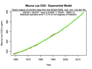
 The graph of the exponential growth of the CO2 concentration of the atmosphere, the Keeling Curve, was introduced in another East County Magazine article. ( http://eastcountymagazine.org/global-warming-has-anyone-really-done-anyt... ) That article details how a simple exponential formula very closely matches the history of the buildup of CO2 in our atmosphere and how that formula can predict future concentrations. (Note 4)
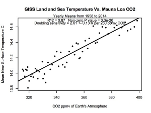
The author used a graph below of the strong relationship between our planet's average near surface temperature and atmospheric CO2 in previous articles as a decoration. The strong relationship between the planetary temperature and CO2 is illustrated here. Below, a simple line explains the relationship, just as a simple exponential curve explains the growth in CO2 concentration in the graph above. The slope of this line is known as the "sensitivity" of the climate to CO2. CO2 sensitivity is often measured in temperature change per "doubling" of the estimated pre-industrial CO2 level of 280 ppmv. This includes not only the heat trapped by the CO2 greenhouse effect, but the magnification of climate feedbacks as well. (Note 5)
(Notes 6, 7, and 8)
Now, let's do the algebra. We want to project the temperature. We have two data files, CO2 concentration as a function of years of time and temperature as a function of CO2 concentration. We've determined that the first data are described by an exponential function and the second data are best represented by a simple line. So, lets ride the exponential curve of the first data file from years of time to CO2 concentration, then follow the line of the second file from CO2 concentration to temperature.
The result in red shows about 5K, or 9 degrees F, of warming between 1880 and 2100, with most of that to come. The points in green are the actual measured temperatures. Note that they closely follow the red line which represents the model's output. This near replication of past observations is a validation of the model.
This little exercise in simplification agrees with the big time climate models. It resembles the Intergovernmental Panel on Climate Change's Assessment Report RCP 8.5 case, which is their high range scenario "without additional efforts to constrain emissions." (Page 8 of AR5 Summary Report) (Note 9) This is exactly what we should expect! We drove this simulation with the Keeling Curve, actual measurements of CO2 in our planet's atmosphere.
 What if mankind cleans up its act and successfully constrains CO2 and other greenhouse gas emissions? What would our model say then? One would need to change the input data and recompute the model, tasks easily done on today's personal computers. The model would then tell us about how much our efforts paid off, and that is a useful tool for planning the future. (Note 10)
Like the young woman in the song "The Itsy Bitsy Teenie Weenie Yellow Polka Dot Bikini," I'm scared. You should be scared, too. The CO2 concentration record clearly shows mankind isn't cleaning up its act. Human civilization will not survive the exponential ride to a 5K warmer world caused by this. My T-shirt says, that is, "The World Going to Hell, and Speeding Up Getting There."
Roger Coppock is a retired computer scientist and serious amateur climate scientist who does not look good in a bikini, yellow polka dot or otherwise. He does wear a "World Going to Hell." global warming protest T-shirt.
NOTES:
0) Anna Paola in a "Shameless Charlotte" bikini by Rick Iossi, creativecommons.org. Polka dots by Miriam Raftery.
1) http://www.robelle.com/smugbook/laws.html
2) https://www.youtube.com/watch?v=ICkWjdQuK7Q
http://en.wikipedia.org/wiki/Itsy_Bitsy_Teenie_Weenie_Yellow_Polka_Dot_B...
3) For an example of a large climate model program, please see:
http://en.wikipedia.org/wiki/Community_Climate_System_Model
4) The CO2 concentration data are found at NOAA ESRL, the National Oceanic and Atmospheric Administration's Earth System Research Laboratory:
ftp://aftp.cmdl.noaa.gov/products/trends/co2/co2_mm_mlo.txt
The data file was sampled on 1/06/15.
5) The global yearly mean near surface land and sea temperature record is found in the column labeled "AnnMean" and "J-D" in the file at the URL below.
http://data.giss.nasa.gov/gistemp/tabledata_v3/GLB.Ts+dSST.txt
The data file was sampled on 1/XX/15 and includes all 12 months of data for the year 2014.
These data are part of the "GISTEMP" product from NASA's Goddard Institute For Space Studies. The GISTEMP process corrects NOAA temperature data for UHI, the Urban Heat Island effect, by using satellite observations of artificial night lighting to estimate the locations of urban and rural areas. Please see:
http://data.giss.nasa.gov/gistemp/
6) Both the graphs of the exponential rise of atmospheric CO2 concentration and the relationship between temperature and CO2 were produced by the author with the "R" statistical package. The author also used the "R" statistical program to calculate the model and graph the output. The R statistical package can be found here:
R Core Team (2014). R: A language and environment for statistical computing.
R Foundation for Statistical Computing, Vienna, Austria. URL
7) The current R version, 3.1.2 (2014-10-31) -- "Pumpkin Helmet", is partially documented in the "R Full Reference Index." This 8.88 MB PDF document is 3,409 pages long. This manual does not cover the many language extension packages, each of which has its own manual. The author has found that his R scripts run or crash on a difference as small as a comma in this documentation. That makes the "R" Statistical Package program way, way, way overdue for an Itsy Bitsy Teenie Weenie Yellow Polka Dot version. This important task I leave to the next generation.
8) For simplicity's sake, we consider only CO2 here. There are other greenhouse gases in our planet's atmosphere. Mankind is responsible for increasing the concentrations of these gases too. The model includes their effect because, currently, the rise of the concentrations of these other gases closely follows the history of CO2's increase. Therefore, the CO2 to temperature data includes them, because they just add to CO2 forcing.
One might expand this model by inserting a sum of the radiative forcings of several greenhouse gases instead of just the CO2 concentration. The URL below points to a list of other greenhouse gases and an example of summing forcings:
http://www.esrl.noaa.gov/gmd/aggi/aggi.html
9) CLIMATE CHANGE 2014 Assessment Report 5 Synthesis Report by the IPCC
http://www.ipcc.ch/pdf/assessment-report/ar5/syr/SYR_AR5_LONGERREPORT_Co...
Section 2.2.1 and Figure 2.1 (a) and (b)
10) The greatly simplified model presented here is a static relationship between curve fits of two sets of measurements. It does not simulate dynamic relationships between variables. For example, the oceans create a thermal reservoir which delays the forcing by greenhouse gases like CO2 and the temperature of the atmosphere. Heating of the air must wait about 4 decades for the water of the oceans to warm too. This dynamic relationship requires differential equations not found in this model to simulate.


Comments
global fraud
Dream On.
Getting really hot
http://www.foxnews.com/weathe
Weather and Climate
BAD NEWS!
Well....